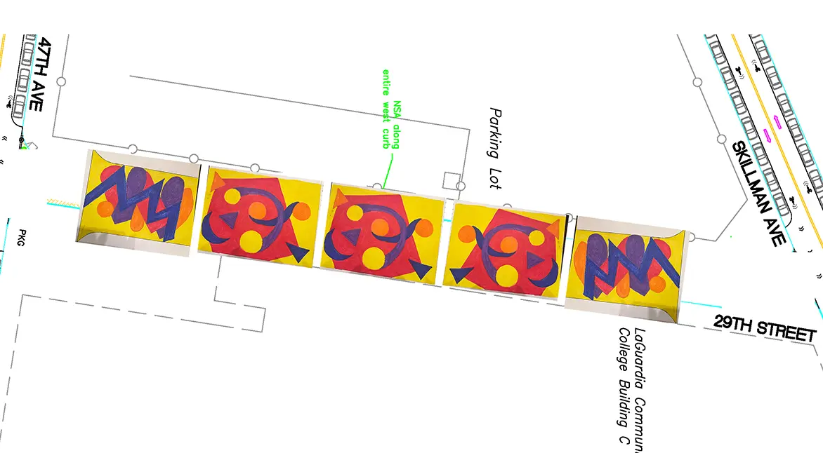
The LaGuardia Community College needs your help in selecting a winning design for the street mural that will be installed on the LaGuardia Community Greenway, located on 29th street (between 47th Avenue and Skillman Avenue) in Long Island City. Entries represent a diverse collection of color, patterns, and vibrancy that will enhance the Greenway as a public space for the entire community to gather and engage.
To vote, please SELECT ONE of the following designs by clicking/checking the box and clicking on “Submit.” You can vote more than once.
Voting Integrity: The use of bots, automated scripts, or any fraudulent voting methods is strictly prohibited. Any entry found to be in violation of this rule will be immediately disqualified.
The winner will be announced by Kenneth Adams, President of LaGuardia Community College, during his Closing Sessions address on May 30 at 10 a.m.
The Top 5 vote-getters will receive a certificate and a Starbucks gift card. The winning artist will receive a certificate, a Starbucks gift card and a LaGuardia swag bag!
Voting opens at 9 a.m. May 21 and closes at 5 p.m., on May 27!
Select the individual images to see a larger version.
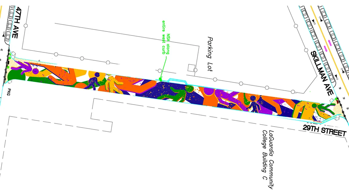
“Keep It Movin!!” features a series of walking signals, representing our walkable city. Each signal is shown in a different color, symbolizing the five train lines that run through Long Island City, the G, E, F, R/N/W, and 7 trains.
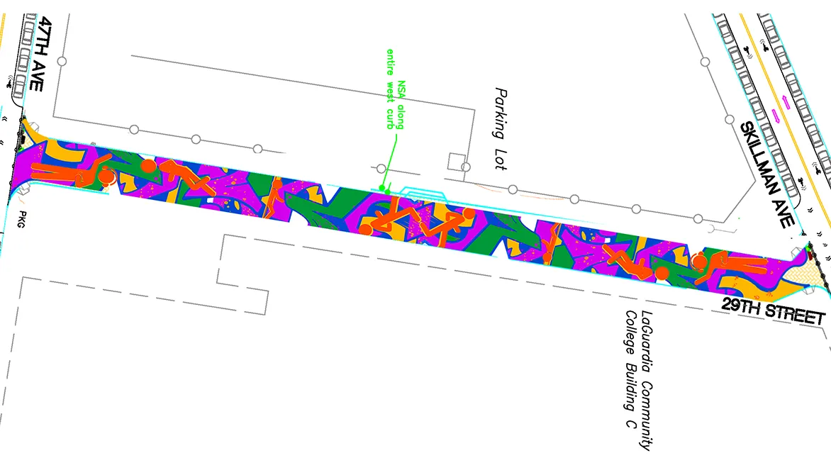
“Rhythm to Our Walk” uses the same color palette to reference these lines while also paying tribute to 5 Pointz with a graffiti-style background.
“The Fabric of Queens” is inspired by materials, textiles, textures, patterns, and prints from articles of clothing that I tend to see on my way to LaGuardia from the Court Square train station.
"Growth" responds to Long Island City’s status as the fastest-growing neighborhood. Students come to LaGuardia Community College hoping to grow into a better life for themselves and their families. Queens offers the nutrients through a uniquely diverse population to make that growth possible.
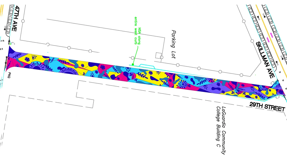
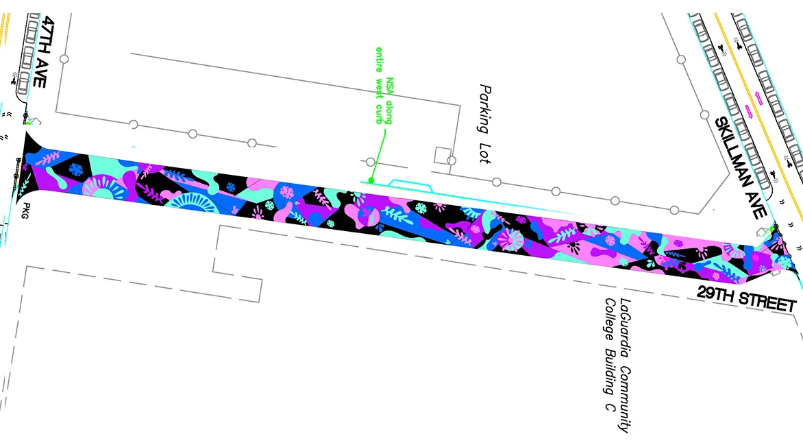
I wanted a design with colors as diverse and vibrant as the people who live in New York. I made two versions, one more colorful and the other darker, while still highlighting the colors.
I wanted a design with colors as diverse and vibrant as the people who live in New York. I made two versions, one more colorful and the other darker, while still highlighting the colors.
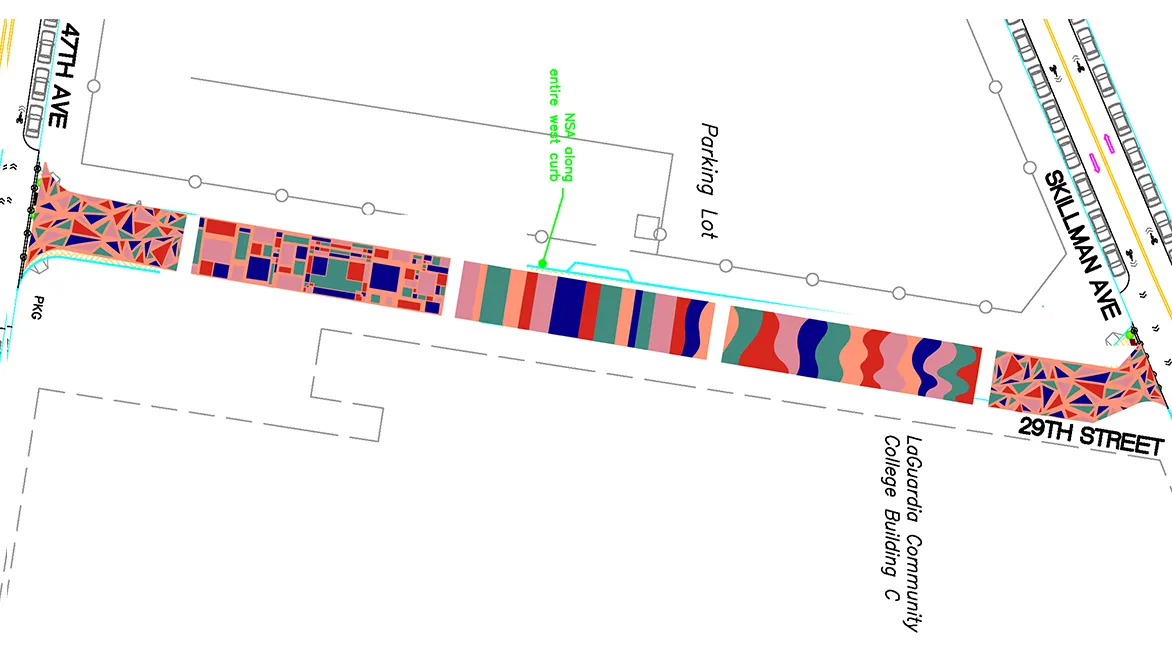
These mural designs are inspired by the diversity of cultures gathered in Queens. Among all the boroughs in New York, I would say Queens is the one that feels like an international family. The borough is full of families that come from everywhere, which makes a warm and mindful neighborhood.
These mural designs are inspired by the diversity of cultures gathered in Queens. Among all the boroughs in New York, I would say Queens is the one that feels like an international family. The borough is full of families that come from everywhere, which makes a warm and mindful neighborhood.
The main idea for this work was cultural diversity. We came up with an idea using shapes and lines that blend together and gather up closely.
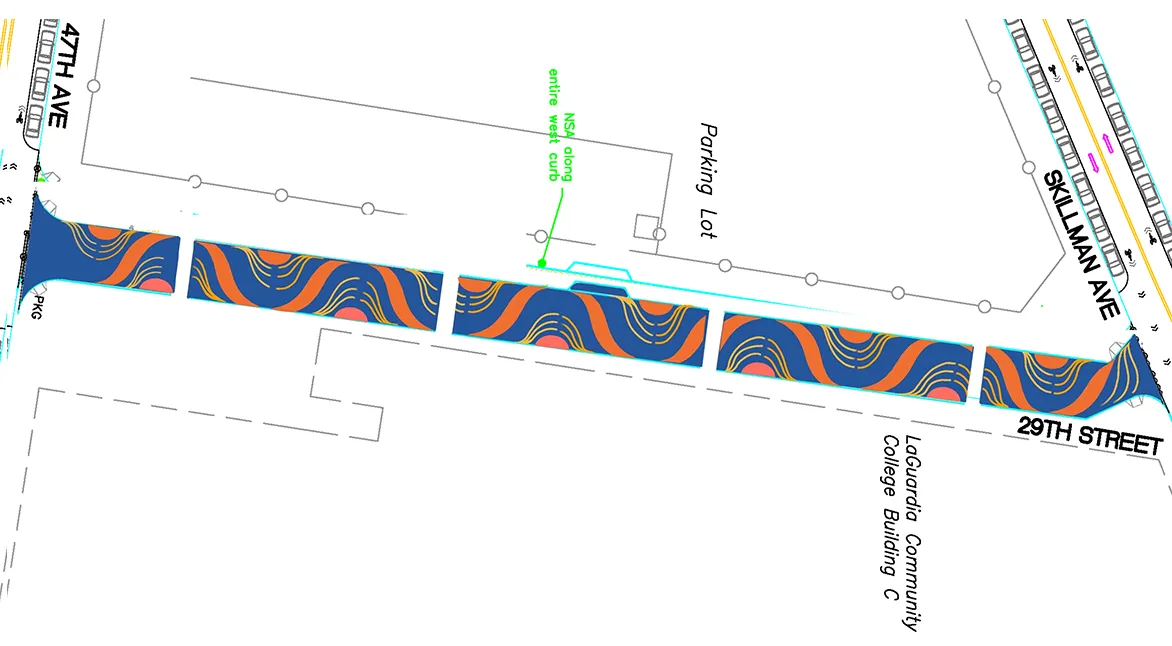
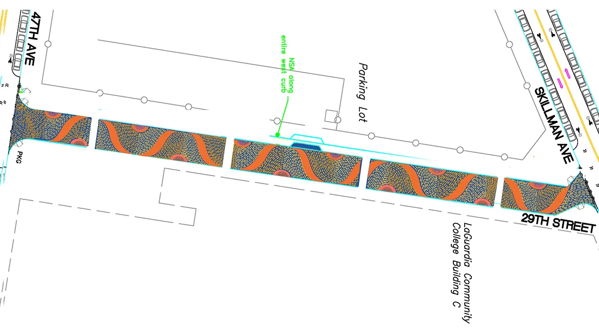
I designed two concepts using a blue and orange color palette, which I chose for its year-round appeal in New York and its calming effect near a school. Both of my designs, ranging from simple linear flows to more detailed wave patterns, aimed to create a peaceful and serene atmosphere for the community.
I designed two concepts using a blue and orange color palette, which I chose for its year-round appeal in New York and its calming effect near a school. Both of my designs, ranging from simple linear flows to more detailed wave patterns, aimed to create a peaceful and serene atmosphere for the community.
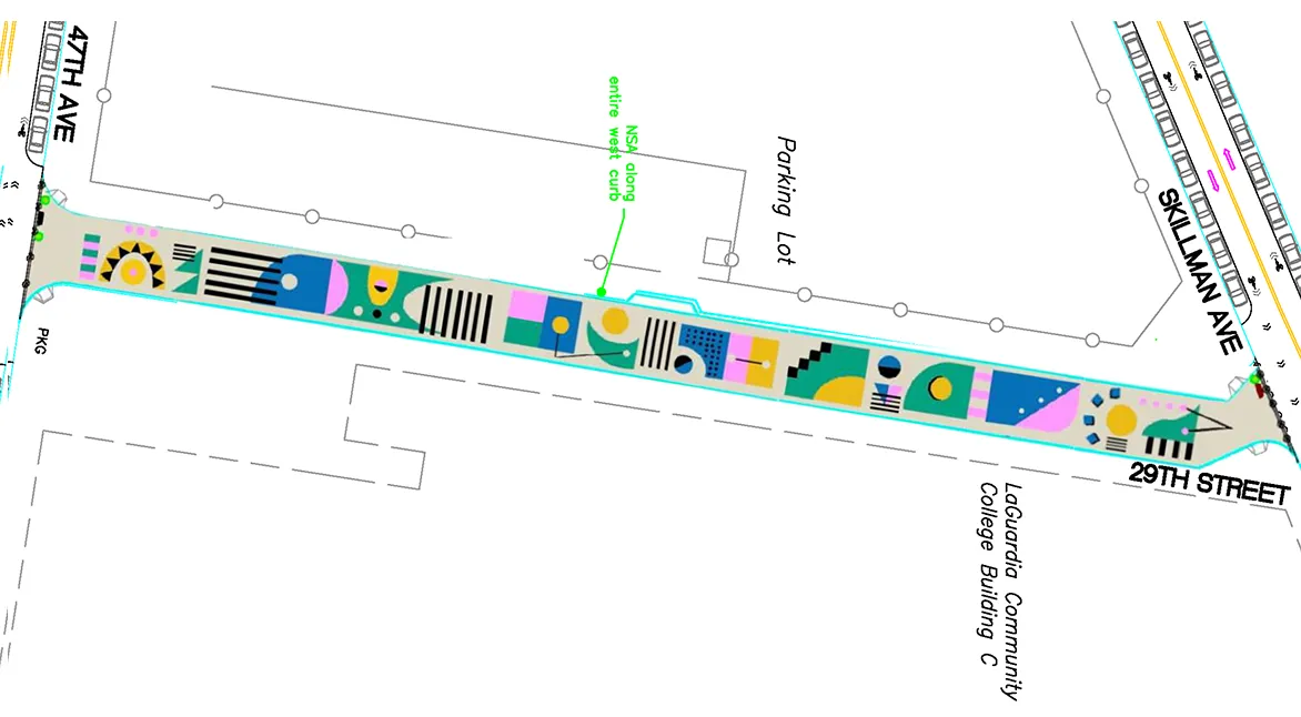
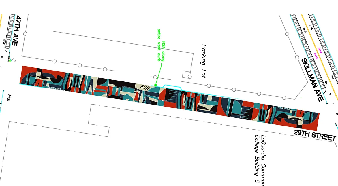
This design is geometric abstract art inspired by the Bauhaus movement. My idea was to transform simple forms into a modern design that matches the architectural character of Long Island City.
"Blooming" is inspired by spring and growth. Since this mural is in front of a place where growth happens in many forms, the mural reflects the spirit of LaGuardia—a growing community where we all blossom together.
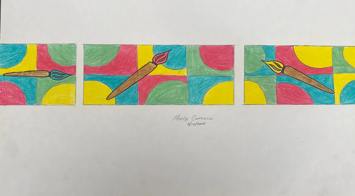
I decided to make my design because I love art, and a paintbrush is a big representation of it. I chose the primary colors because those were the first colors I learned, as well as green, because if it’s going to be outside, we should see more greenery in nature in New York City.
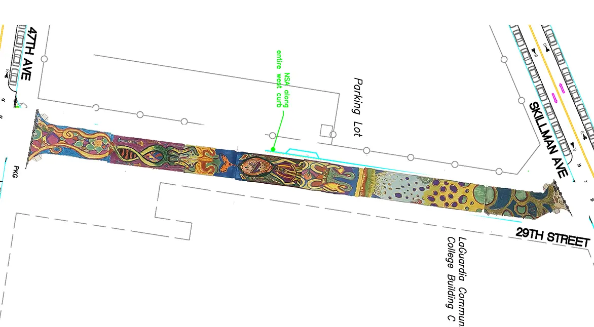
Beautifully abstract with colors that pop, wacky wavy shapes and lines that contort in a variety of different directions, with a dream-like and aquatic aesthetic.
The design incorporates elements from Queens’ landmarks and its history in simple shapes and colors. The first page is the design placed over the provided street diagram, the third page is the design by itself.
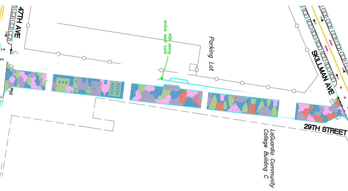
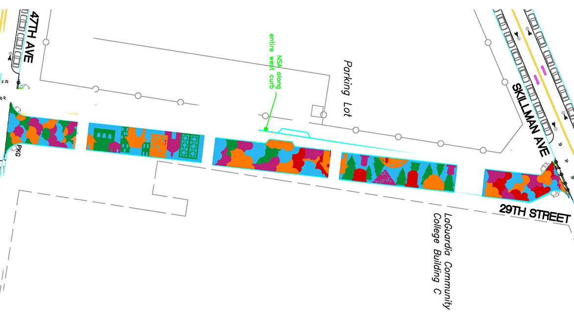
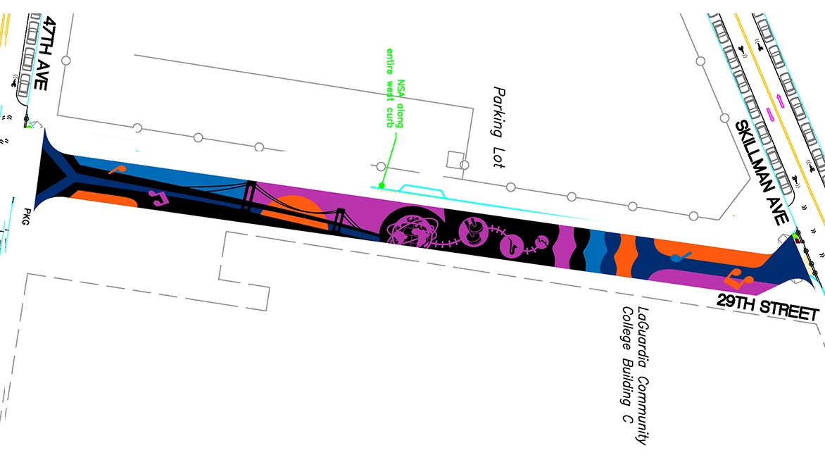
In this abstracted representation of the New York cityscape, perspectives shift as you look up from street level and down from above. From its towering spires to its modest duplex homes, to the hustle of the bridges and trains, there is a kinetic energy that is constantly in motion and changing, and is always uniquely New York.
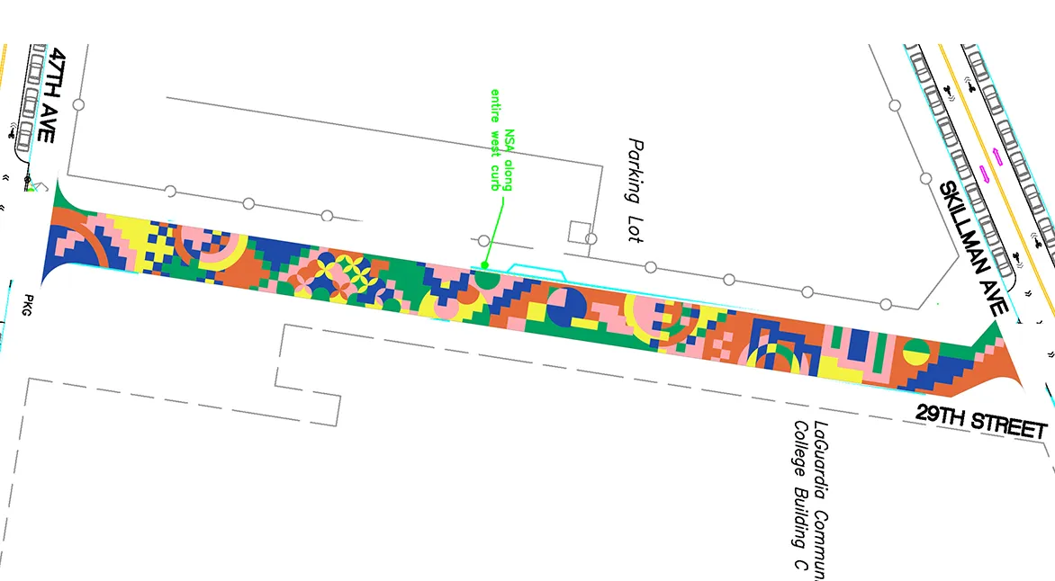
This geometric collage blends bold primaries—vivid blue and bright yellow—with softer tones like beige and subdued gray, crafting a composition that feels both balanced and rhythmic.
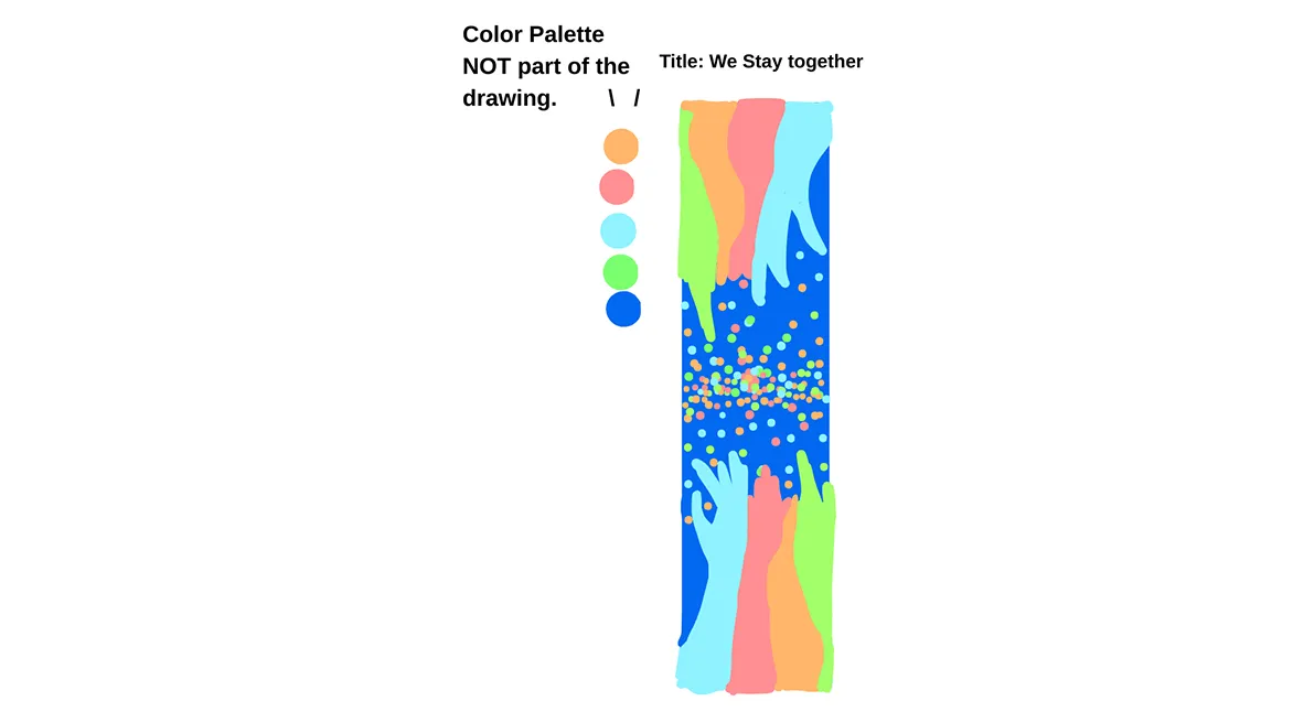
I made a design where the background is a dark blue; you can see lots of pastel and vibrant colors. They’re shaped to look like hands, on both the top and bottom side, which makes it show how, as a community, we stick together—even in the darkest times, we band together.
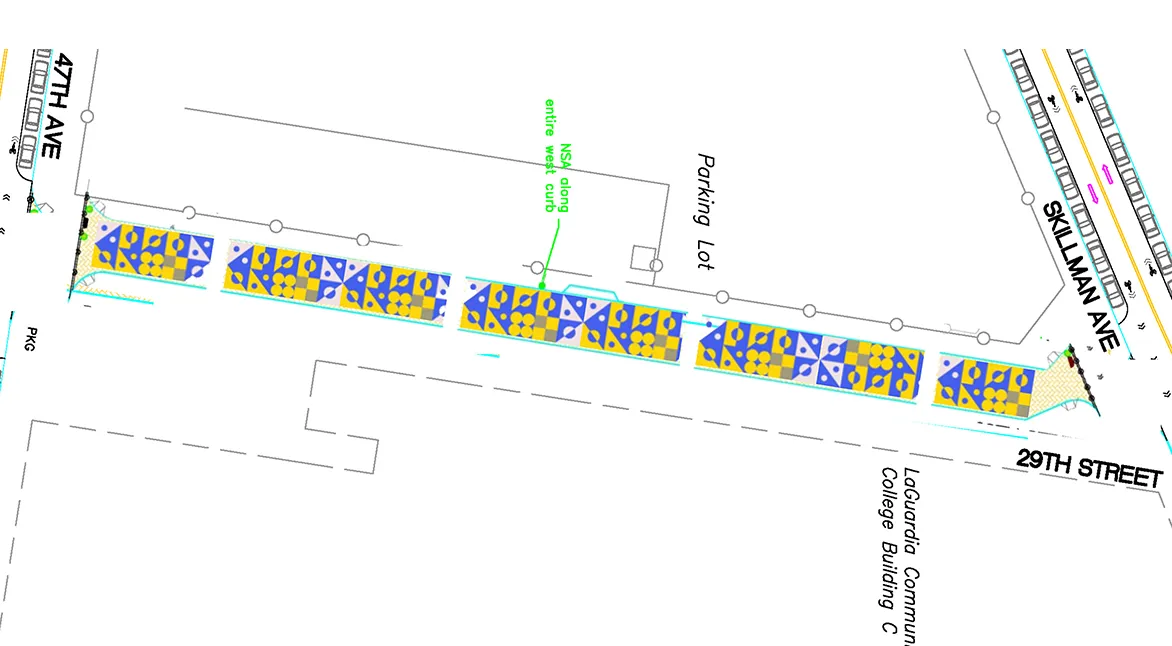
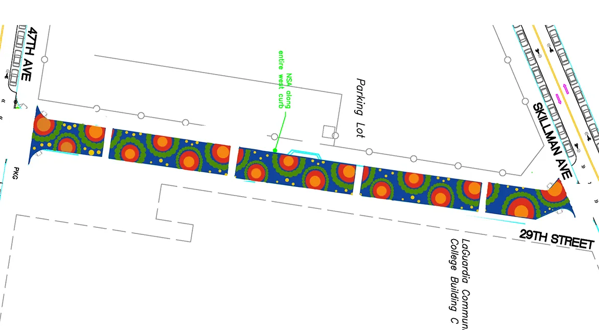
I created a repeating pattern of concentric circles in red, orange, yellow, and green against a deep blue background. This design is a stylized take on ripples in water. I used concentric circles to create a sense of gathering and shared space.
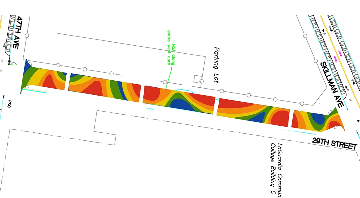
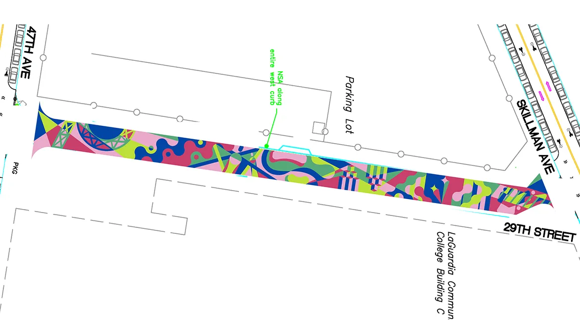
I created an undulating pattern that resembles a topographical or thermal map to create a sense of movement. I chose this design because of the way the colors blend together in harmony. The organic shape of the curves represents the adaptability and ever-shifting environment of our community.
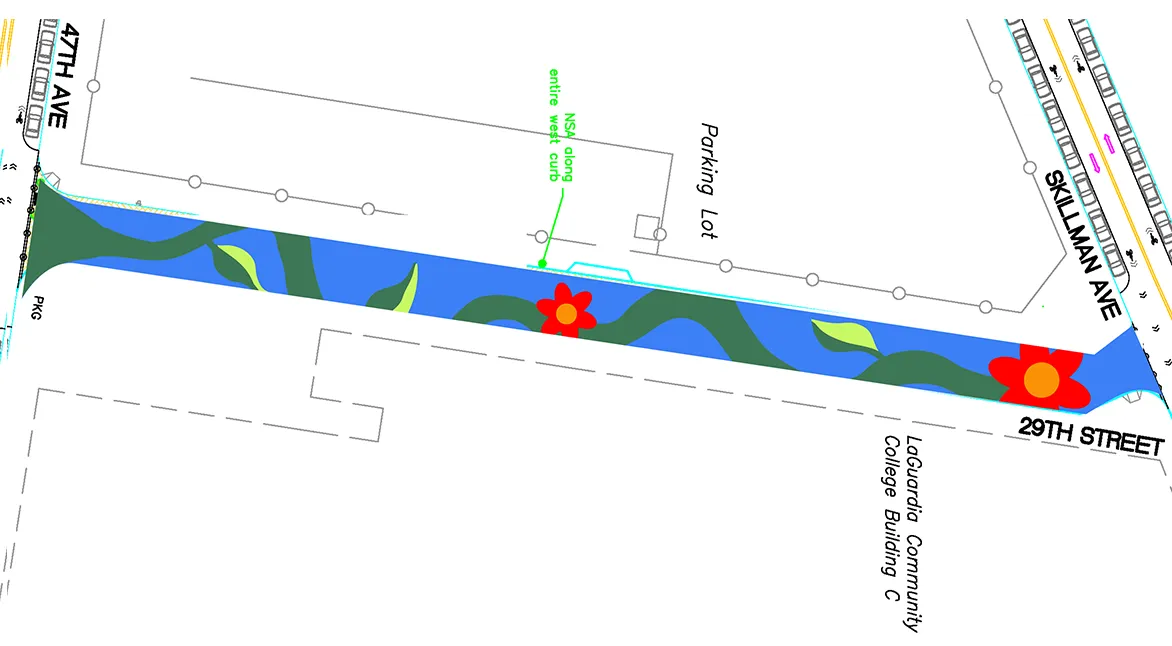
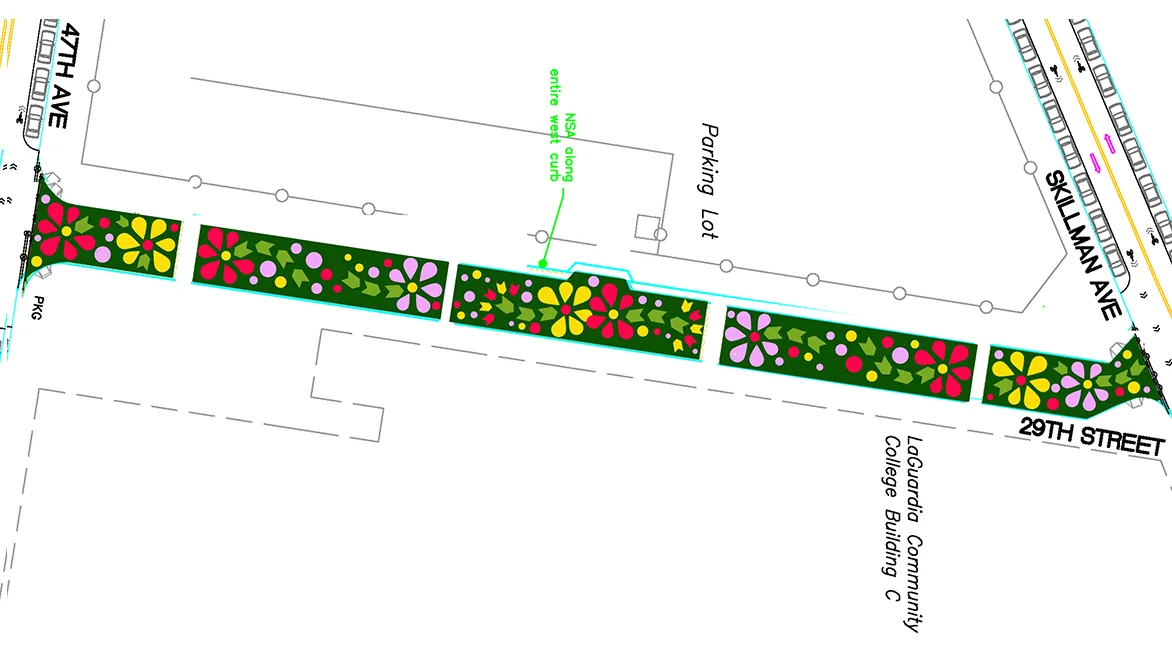
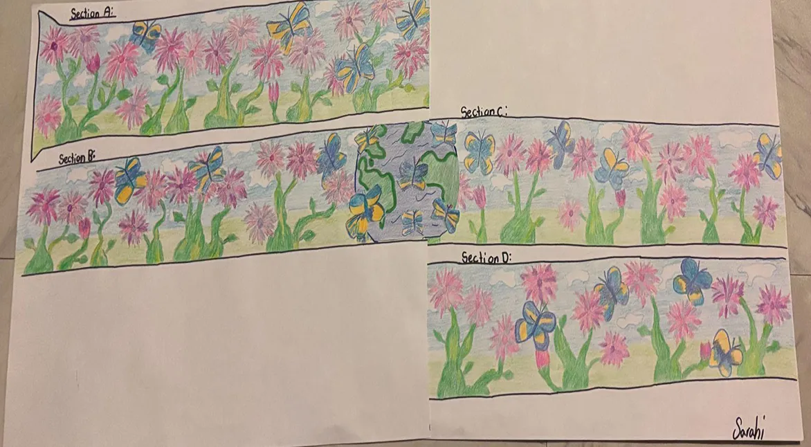
This design represents the beauty of Mother Earth and its nature: a clean blue sky without smoke, flowers giving color and life to the world. The butterflies represent freedom, expanding their wings, flying all over, and enjoying the beauty of Earth.
Both designs are inspired by the history of the neighborhood of Long Island City and the present-day character of the neighborhood. In order to create a vibrant design that reflects the neighborhood, I was heavily inspired by the industrial history of the neighborhood, which are reflected in many of Long Island City's iconic landmarks: the Long Island City gantries, the Ed Koch Bridge, and the elevated train line, to name a few.
Both designs are inspired by the history of the neighborhood of Long Island City and the present-day character of the neighborhood. In order to create a vibrant design that reflects the neighborhood, I was heavily inspired by the industrial history of the neighborhood, which are reflected in many of Long Island City's iconic landmarks: the Long Island City gantries, the Ed Koch Bridge, and the elevated train line, to name a few.
This is an abstract design inspired by my family—my husband is a born and raised Queens native— and our favorite colors. It’s also inspired by the vibrant colors that represent Queens’ diversity and vibrancy due to the variety of cultures and nationalities that are an important part of the borough and of LaGuardia Community College, and how all of us are unified in this multicultural borough that many of us reside in and belong to.